Retail comes with a certain set of unspoken expectations. If you ran a brick-and-mortar store, you wouldn’t display all your products in a big unorganised heap. Depending on the kinds of things your store sells, different products need to be displayed differently and in an organised way. Ideally, you would want to arrange them by area or create individual displays of similar products; maybe putting some in glass cases, some on shelves, and others on racks, in line with your customers’ expectations.
Start your 14 day free trial of Storefront Blocks
Customise the WooCommerce Shop Page and Category Pages with our Premium WooCommerce Blocks.
But the same goes for online retail. If you run an online store with WooCommerce, then displaying your products effectively should be your number one priority. You need to draw in site visitors to your homepage, blog, or category pages, rather than just bombarding them with all of your product information at once.
By displaying products properly, you boost product discoverability on your WooCommerce store. This can also help conversions and encourage browsing on your online store. Not only does this help your store look and feel more professional, but it can also help enhance your brand.
With the WooCommerce store layout, all of this seems like a stretch. This is because, by default, the whole layout feels pretty generic and doesn’t offer much customisation. That’s where Storefront Blocks comes in.
In this tutorial, we’ll go over some different ways you can display your WooCommerce products better. We’ll also show you how you can customise how products are displayed on your online store using the Storefront Blocks plugin for WordPress.
Ways to display your products in WooCommerce
There are a lot of ways to display your products in WooCommerce, but it all comes down to what works best for you. It all depends on your tech-savviness, on the type of products you are selling, on the number of products, and on the final result you want to achieve. With this in mind, let’s take a look at two ways to display products in WooCommerce.
#1. The complicated way: WooCommerce shortcodes
Storefront Blocks
Beautiful WooCommerce Blocks
WooCommerce, by default, lets users display products in lots of places on your WordPress site using various shortcodes. It lets you display products by category, sale, featured, and more on your WordPress website.
The only problem is that this isn’t suitable for everyone. For instance, if you have a large store, this can get complicated quickly as you’ll have to cram products into your default category, sale, or featured pages of your WooCommerce store. Customers will find it difficult to navigate and browse through your product offerings when they visit your online store.
Since you’re limited to displaying products in the default WooCommerce layout, no matter how or where you choose to display them, they’ll still look generic. You want to showcase your products and represent your brand in a way that is unique and helps your online store stand out from the rest of the competition.
#2. The easy way: Storefront Blocks
If the default WooCommerce functionality isn’t for you, you can use the Storefront Blocks WordPress plugin to display products in WooCommerce in a neat and organised way.
Storefront Blocks is a WooCommerce plugin that allows you to display your products beautifully anywhere on your site (not just the shop page and category pages) using a range of new blocks entirely within the Gutenberg editor. This means that you can use any of the available Storefront Blocks anywhere on your site where Gutenberg is enabled to create a product catalog. You can even build an entirely new store page using the blocks.
It’s the easiest way to enhance the WooCommerce product display on your online store.
Once customers see a product they’d like to buy, they can simply click the add to cart button to add it to their basket and proceed to checkout.
For instance, if you need to set up a new page where you only showcase clothing-specific products. You can use the Flip Book Block to showcase your products as it will seem more visually appealing to visitors on your WooCommerce store.
The Storefront Blocks plugin lets you change product settings individually on each block, giving you more control over how your WooCommerce store looks and feels. You can select which specific product, featured products, or product categories to show products from. Users can also choose whether to show pagination as this can help with making your WooCommerce store look clean and simple.
Depending on the product, you can also choose to show prices, descriptions, and titles for each product you wish to display on your WooCommerce store. Additionally, you can customise and configure each block exactly how you want directly from within the Gutenberg editor.
Displaying your WooCommerce products better using Storefront Blocks
Storefront Blocks lets its users display products in many different ways, depending on their specific needs and preferences. Let’s take a look at some of the best ways you can enhance the WooCommerce product display using different Storefront Blocks:
Flip Book Block
The Flip Book Block lets you showcase individual products one at a time with a larger image, description, and price. This is ideal for drawing attention to your products and enabling customers to make purchase decisions quickly.
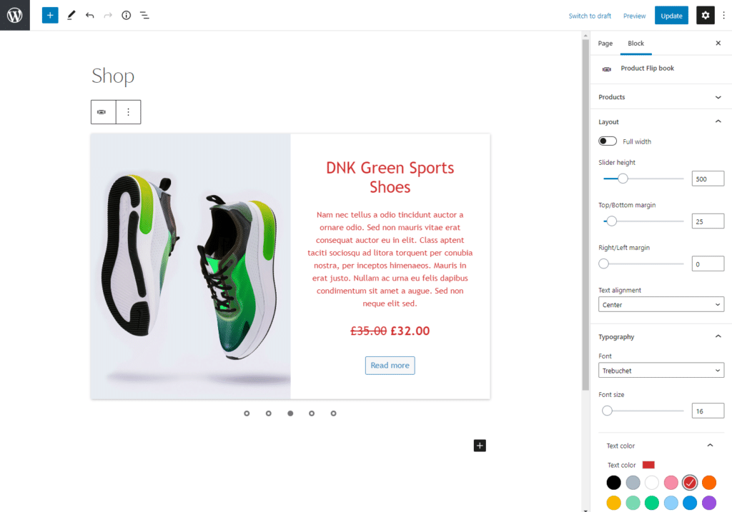
For example, you can display more visual products such as t-shirts, hoodies, and shoes using the Flip Book Block. This way, customers can get a detailed look at your product without having to go to the product page. Instead, they’ll be able to add it to their cart directly from the Flip Book Block.
This is great for featured products and products on sale.
Product Carousel Block
The Product Carousel Block lets users display a carousel of several products at once on a single row that auto-plays. Customers can also scroll through it manually if they prefer. It’s great for drawing attention to a few key visual products at a time.
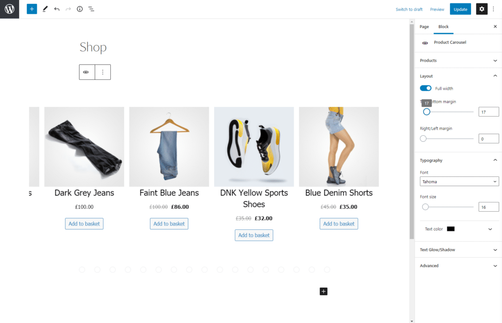
For instance, if you sell art gallery images on your WooCommerce store, showcasing them in a Product Carousel Block will highlight the art pieces and add more value to your products. The Product Carousel Block is perfect for showcasing products cleanly and beautifully on your category or product pages in WooCommerce.
Product Table Block
The Product Table Block lets you display your products in a sortable table with lots of space for descriptions and a Quantity field that the customer can fill in to quickly add many items to their cart. This way, you can display lots of product data in an organised and SEO-optimised way.
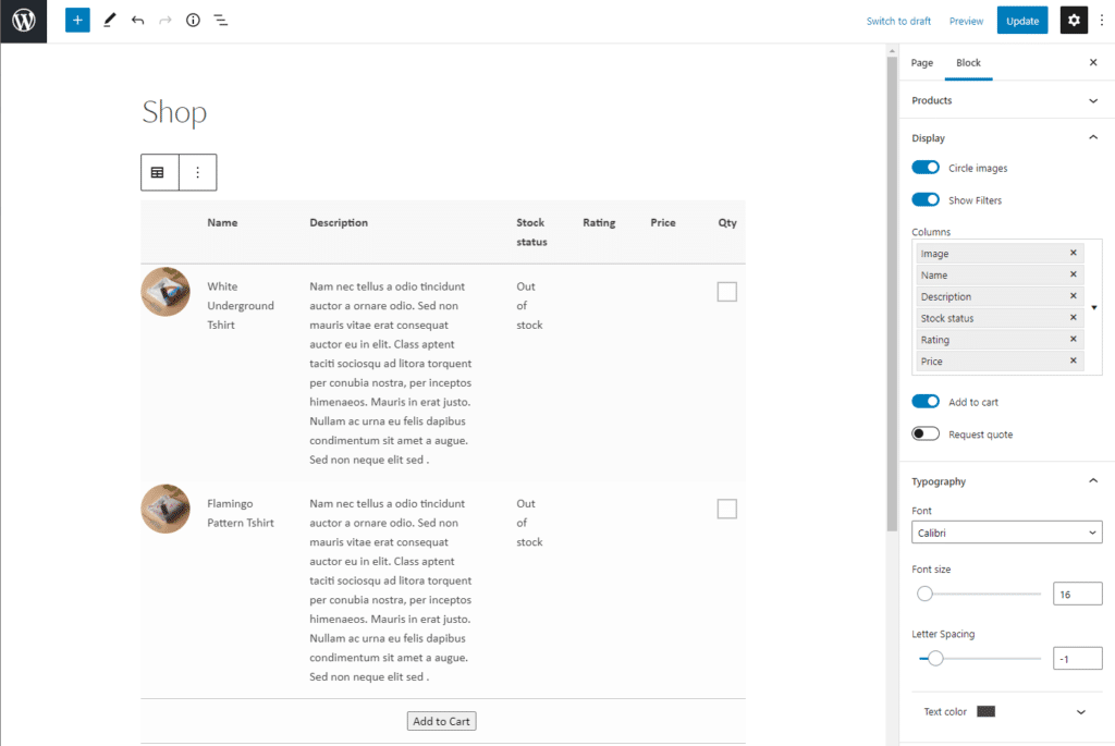
This can help you in displaying more functional products that you know customers come to your store for over and over again. This also helps customers buy products quickly and also allows them to buy multiple products from your store in one go.
If you sell to wholesale customers, you might need to display the product SKU. Using the Product Table Block, you can display the SKU directly on the front-end. All you have to do is make sure you include the SKU column in your table.
Product List Block
The Product List Block lets you display a list of products with small thumbnails and lots of room for product descriptions, price, and add-to-basket buttons. This is great for telling stories about your featured products.
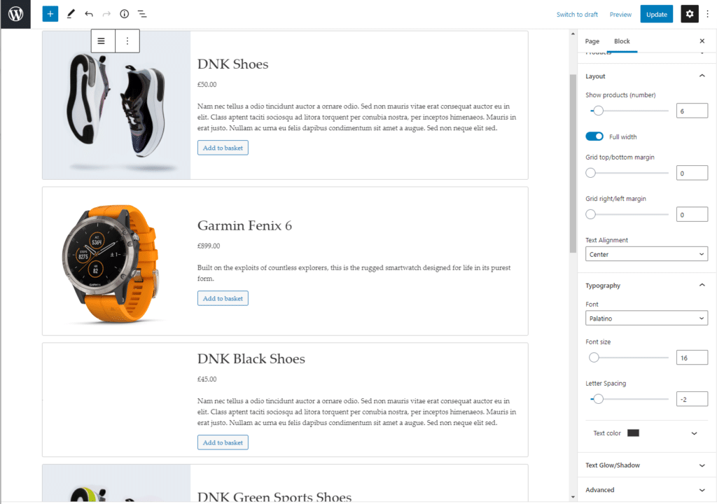
For example, if you offer a 1-week photography training course as a featured product on your WooCommerce store, displaying it using the Product List Block might be a great idea. Since you want to hand out information about your product before the customers buy it, displaying it with a small thumbnail and with a detailed description is the way to go.
Product Grid
The Product Grid Block lets you display your WooCommerce featured products in a clean grid with large images and product names. Customers on your WooCommerce store will be able to click through to the product pages, making the whole experience much more refined and beautiful for customers.
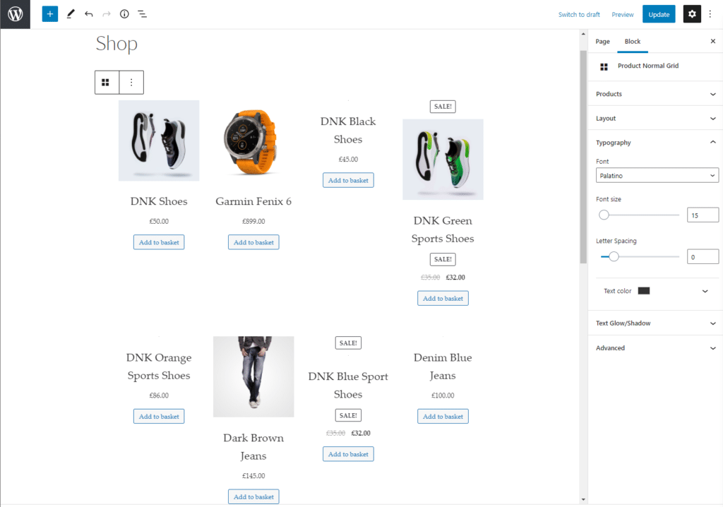
This is great if you’re looking to give a minimalist, professional look to your featured products to help make them stand out in the spotlight. This not only increases product visibility but also helps attract new visitors to your WooCommerce store.
Product Card Block
The Product Card Block lets users display product images on large cards that flip over to reveal product details. This means that when your customer hovers their mouse over the product image, it’ll automatically flip over to reveal the product’s details and information.
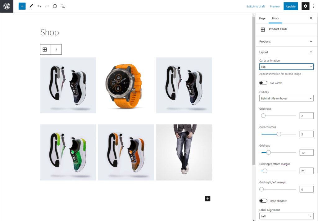
This is ideal for displaying eye-catching products with fine detail on your WooCommerce store. You can use the dropdowns to set the cards’ animation and overlay.
Single Product Block
The Single Product Block does exactly what you expect it to do – it displays a single product. You can display a single product on an eye-catching background, with plenty of space for the price and an add-to-basket button, as shown in the screenshot below.
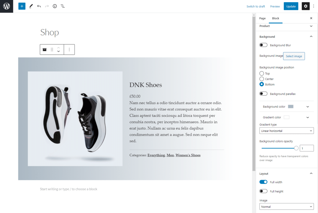
This is great for creating calls to action on your category pages or blogs about specific products. Additionally, it can help you draw more attention to your featured products on your store’s pages.
Masonry Product Block
With the Masonry Product Block, you can showcase many products on your WooCommerce store at once in an attractive masonry layout. This is great if you have lots of beautiful products you want to showcase in one category Masonry Block.
The different dropdown options let you customise the Masonry Product Block in different ways.
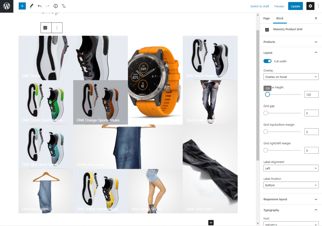
It also lets you display featured images for your store’s product category pages. This can help you boost engagement on your product category pages and stand out from the competition.
Additionally, this can be a great way to invite users to browse your store and check out other products you sell. If they like what they see, they’ll end up clicking on it and browsing through other product offerings on your WooCommerce store.
Customising Storefront Blocks
Each block you add to your e-commerce store is fully customisable. The Storefront Blocks plugin allows you to design it according to your specific needs. This means that every single block comes with a huge amount of customisation potential, including:
- Changing the number of rows and columns in grids
- Changing gaps between grids and font
- Customising margins
- Adding Shadows to give it more of a professional look
- Setting different colors to ensure your branding won’t be compromised
- Choose from a variety of different fonts
- Different displays on mobile versus desktop that can help you preview your WooCommerce store before going live
Whatever you’re selling and whatever your store’s aesthetic, Storefront Blocks can fit right in and help you achieve the exact look and feel you’ve envisioned.
Conclusion
Displaying your WooCommerce products in a visually appealing way can not only help you showcase your product offerings better, but is also a huge factor in attracting new visitors to your WooCommerce store. After all, a great visual merchandising strategy is a key part of any e-business.
With the Storefront Blocks plugin, you’re not limited to the Shop page. You can showcase your products wherever you’d like following the different options we explained in this tutorial. This way, you’re able to enhance the WooCommerce product display in a few steps.
We’ve shown you some of the easiest ways to display your WooCommerce products cleanly and professionally without having to tweak PHP templates or use HTML or CSS code. Hopefully, you’re in a good position to take the next steps.
Ready to start showcasing your WooCommerce products better? Get Storefront Blocks today!
Leave a Reply