In the same way that vinyl album covers defined an era of music, YouTube thumbnails are becoming the cultural artefacts of our digital age.
They’re not just scroll-stoppers – they’re the new album covers, and perhaps the purest design challenge of the internet era. They live at the intersection of emotion, speed, and performance, where aesthetics collide with brutal analytics.
It’s here that creativity gets tested in the most public way imaginable.
YouTube thumbnails, at their best, are an emotional punch to the gut. They have one job: to make you click. And in a sea of infinite content, they must do it fast.
Over the past few years, I’ve become obsessed with this format, diving deep into what makes a YouTube thumbnail truly irresistible.
A big part of that journey has been inspired by Jake over at creator hooks. , whose insights into titles and thumbnails opened my eyes to the emotional mechanics at play.
I’ve even built my own site dedicated to exploring the craft and psychology behind them: https://curiosityhopefear.com
That name – Curiosity, Hope, Fear – isn’t just branding.
It’s the beating heart of what makes a thumbnail work. These are the three emotional triggers that drive attention, intrigue, and action. Every successful thumbnail leans into at least one. The best? They hit two. Sometimes, just sometimes, all three.
Let’s look at three standout examples:
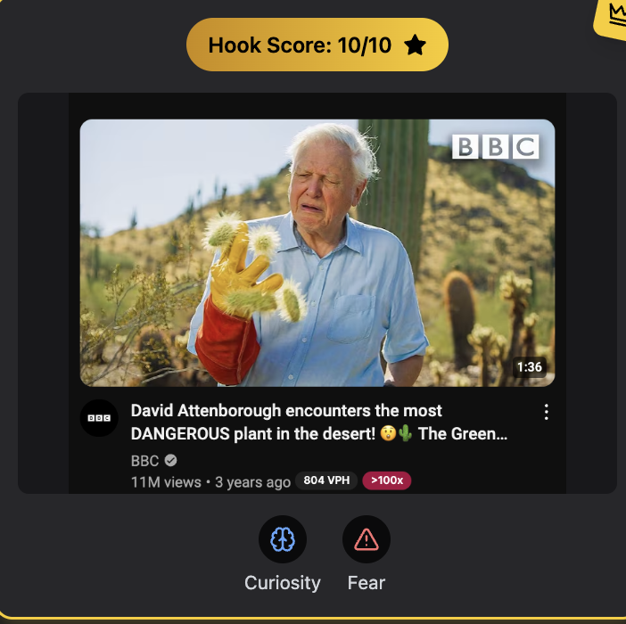
BBC Earth – “David Attenborough encounters the most DANGEROUS plant in the desert!” This thumbnail is pure curiosity-meets-fear. We see Attenborough grimacing in pain with a cactus wrapped around his gloved hand. The colours are intense, the scene is surprising, and the implication is immediate: what on earth is going on here? It’s emotional and primal.
Top Speed Golf – “How to Hit the Ball Then The Turf With Your Irons” At first glance, this is a simple image – but it packs a punch. You see the result of a perfect golf swing: clean divots, precision, calm. It taps into hope and curiosity. Hope that you, too, could finally hit that perfect shot. Curiosity about how.

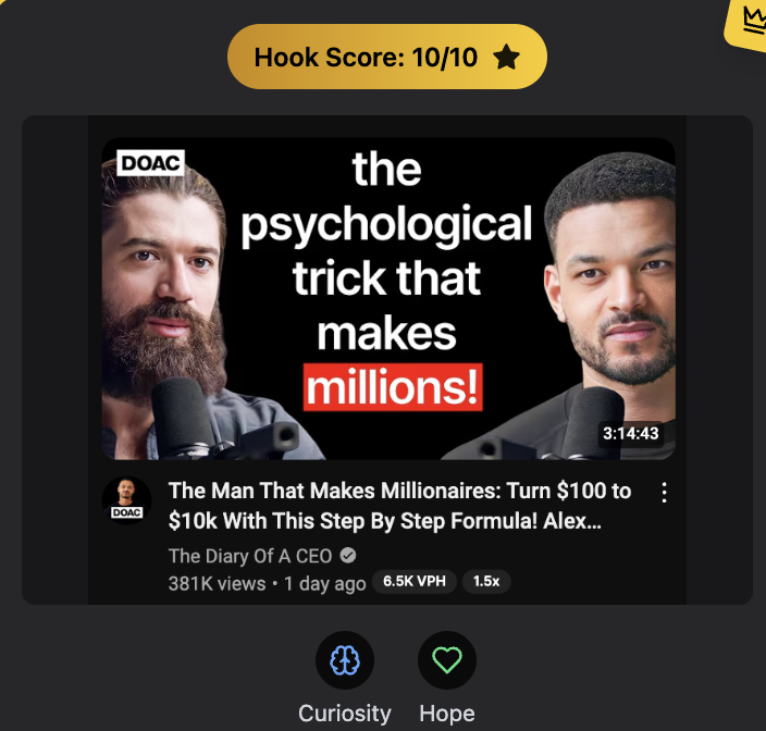
The Diary of a CEO – “The psychological trick that makes millions!” Big text. Direct promise. Faces full of intensity. This is curiosity and hope in harmony. The language is clear and bold, but what makes it irresistible is the implication: “This could change your life.”
For designers, thumbnails are a dream and a nightmare. They’re one of the best real-time tests of your creative skill. Why? Because you get immediate feedback in the form of Click-Through Rate (CTR). CTR is the percentage of people who see your video and choose to click on it. A CTR above 10% in the first 12 hours is a solid sign your thumbnail is resonating. But that number isn’t fixed – it often drops as YouTube begins to show the video to a broader audience. That’s normal. What matters is that first burst of traction.
Brands often struggle with thumbnails. They’re boxed in by strict guidelines: fonts, colours, logos, tone. That makes it hard to tap into raw emotion. But there is a delicate, brilliant dance to be done between emotional resonance and brand fidelity. The sweet spot exists – and finding it is the mark of a great designer.
Then there’s the interplay between thumbnail and title. Here’s the rule: don’t duplicate. The thumbnail and title should be partners, not twins. If the title asks a question, the thumbnail should hint at the answer. If the title teases drama, the thumbnail should visualise the stakes. The biggest mistake I see is folks using the same language and tone in both. It flattens the intrigue.
Packaging matters because of how YouTube works today. This isn’t like traditional search engine optimisation where keyword stuffing ruled. YouTube is powered by suggestion and recommendation. It pushes videos not because of metadata, but because of performance. If your thumbnail and title spark real emotional engagement, the algorithm notices. And rewards you.
That’s one of the reasons I love YouTube. The algorithm isn’t about tricks or hacks. It’s about understanding human psychology. It’s about emotion. And it gives creatives a live-testing ground where the best ideas rise.
To me, a good thumbnail and title pairing is part art, part science. It’s about feel and feedback. And while ‘clickbait’ has become a dirty word, I think it’s misunderstood. Clickbait is when you don’t deliver on the promise. But a great thumbnail? It makes clicking feel unavoidable. Not because it deceives, but because it connects.
If you’re designing for YouTube, remember this: emotion wins. Aim to spark at least one of the big three – curiosity, hope, fear. Two is excellent. And when you hit all three? That’s when magic happens.
Leave a Reply