Introducing Storefront Blocks version 3.4, including the WooCommerce Mini Cart Gutenberg Block and the new Sliding Product Tiles Block

Today we released version 3.4 of the Storefront Blocks plugin for WooCommerce. Storefront Blocks lets Store Owners customize their WooCommerce Storefront using a collection of Gutenberg Blocks.

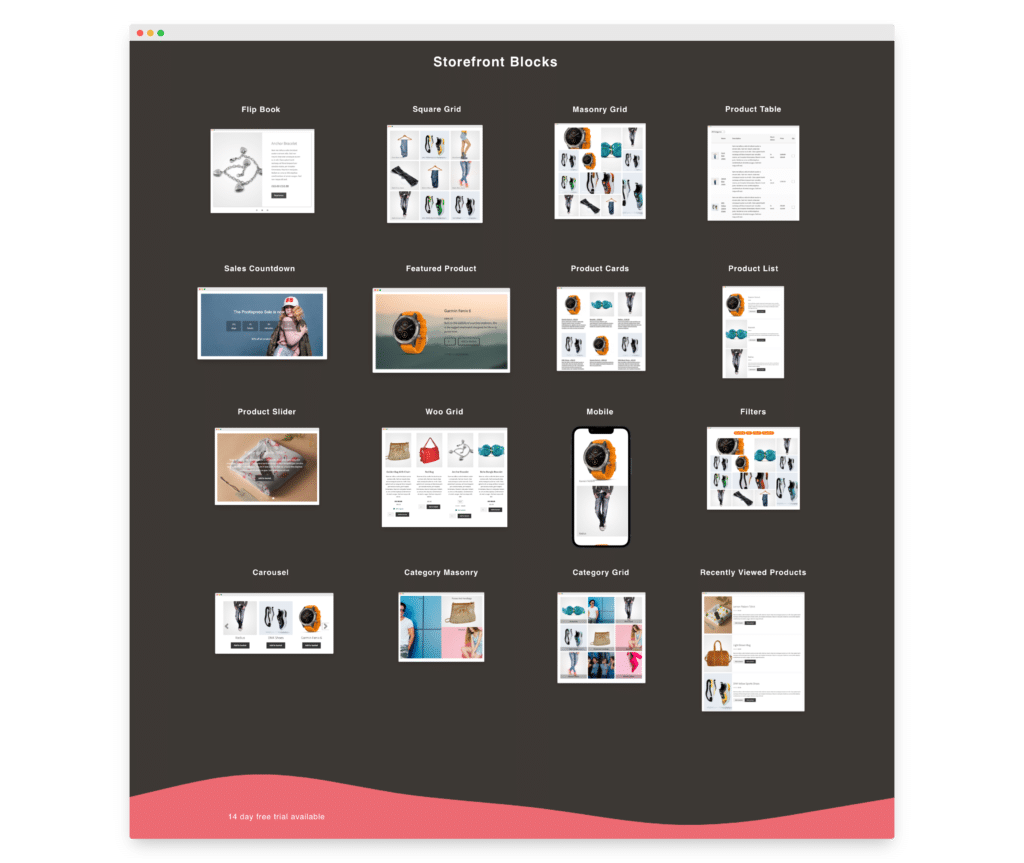
You can see the Gutenberg Blocks included with Storefront Blocks in the picture over on the right πŸ‘‰

Version 3.4 contains two new exciting Gutenberg Blocks.

  • WooCommerce Mini Cart Gutenberg Block (version 1)
  • The Product Sliding Tiles Block
premium woocommerce blocks

WooCommerce Mini Cart Gutenberg Block (version 1)

To fully enable Full Site Editing and WooCommerce, site builders need a number of things which we have now finished building at Pootlepress.

  • Single Product Page Template Blocks (now available through our WooBuilder blocks plugin)
  • Dynamic Product Blocks for WooCommerce Category, Tag and Shop pages (now available with Storefront Blocks)
  • Shop pagination, Shop breadcrumbs, Shop sorting, and Shop results blocks (now available with Storefront Blocks)
  • Dynamic Category and Tag Heading and Description blocks (now available with Storefront Blocks)
  • WooCommerce Mini Cart Block (now available with Storefront Blocks)

The WooCommerce Mini Cart Gutenberg Block

The WooCommerce Mini Cart is typically found in the header of your WooCommerce Store.

With Full Site Edting the Mini Cart is now very simple to add and position.

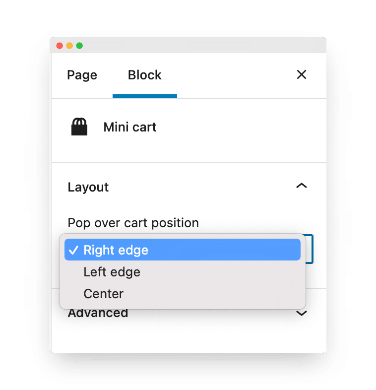
Version 1 of our WooCommerce Mini Cart Block comes with just three simple layout settings.
Introducing Storefront Blocks version 3.4, including the WooCommerce Mini Cart Gutenberg Block and the new Sliding Product Tiles Block 1

We are now working on version 2 of the WooCommerce Mini Cart Block that will have extensive customization options πŸ˜€

The Product Sliding Tiles Block – let me know if you think this is crazy or cool!

One of my complaints with the plethora of Gutenberg Block Libraries that have been released so far, is that they all tend to look the same. With Storefront Blocks my plan is to now focus on creating the most innovative Blocks in the WooCommerce market. I want to create Blocks that give store owners the opportunity to create unique experiences for their customers. This for me, is what is really exciting about Gutenberg!

We have already built some really innovative WooCommerce Blocks, including the lovely Flip Book Block, the snazzy Masonry Block, and a cool Sales Countdown Block.

But now we’ve pushed things even further with the Product Sliding Tiles Block.

I expect this Block to split opinion. But that’s the point. I want to push the boundaries of what’s possible with Gutenberg.

I personally love it, but I fully understand that some will not.

Click here to see a live demo

…and here’s what it looks like in action. πŸ‘‡

For version 1 of the Product Sliding Tiles block we’ve limited the number products that can be displayed to 10. But depending on feedback we’ll increase that.

So let me know what you think of the Product Sliding Tiles Block by posting either Cool or Crazy in the comments below πŸ‘‡

Thanks for taking the time to Pootle and see you soon.

Jamie

ps if you want to take a free 14 day trial of Storefront Blocks click here


Comments

25 responses to “Introducing Storefront Blocks version 3.4, including the WooCommerce Mini Cart Gutenberg Block and the new Sliding Product Tiles Block”

  1. Cool love it

    1. Jamie Marsland Avatar
      Jamie Marsland

      Thanks Gideon πŸ˜€

  2. Cool in a crazy way. Or crazy in a cool way. Either way, I like it πŸ™‚

    1. Jamie Marsland Avatar
      Jamie Marsland

      thank you πŸ™‚

  3. Marion Lloyd-Langton Avatar
    Marion Lloyd-Langton

    Brilliant. Thanks

    Marion

    1. Jamie Marsland Avatar
      Jamie Marsland

      Thanks Marion πŸ˜€

  4. Jamie, I think it is tremendous, especially the backward and forward click on for action. Put a directory on it with multi items in case someone is looking for new ideas with a particular item like ladies shoes or men’s hats.

    1. Jamie Marsland Avatar
      Jamie Marsland

      Cheers Hank – that’s a great idea πŸ™‚

  5. michael Avatar

    very cool. totally agree that all the blocks look the same and very happy to see’ve chosen to take another path.

    1. Jamie Marsland Avatar
      Jamie Marsland

      Thanks Michael πŸ˜€

    1. Jamie Marsland Avatar
      Jamie Marsland

      πŸ˜€

  6. I love it! Please make it up to 20 products or a category!

    1. Jamie Marsland Avatar
      Jamie Marsland

      On the case Bill πŸ˜€

  7. Bob Morris Avatar
    Bob Morris

    Crazy Cool!

    1. Jamie Marsland Avatar
      Jamie Marsland

      Nice, thanks Bob πŸ˜€

  8. Totally cool!!

    1. Jamie Marsland Avatar
      Jamie Marsland

      πŸ‘

  9. WAY cool

    1. Jamie Marsland Avatar
      Jamie Marsland

      Cheers Mark πŸ™‚

  10. Hi Jamie,
    Weird! It reminded me of a manic fruit machine!
    I think the counter motion is a boo boo, it made me feel distinctly queasy.
    Perhaps do it column by column and have a faster/slower button somewhere so you can keep up with the moving products.
    So people will need it to go very slowly,
    some just a whizz through to see whats new ,,,

    Maybe 2 more buttons, to nudge up or down one product image at a time.
    Then you could whizz to get an overview and then go more slowly where there is an interest.

    Thinking about it maybe an accelerator pedal is a better analogy,
    just a slider to go forwards and backwards at different speeds.
    That’s better, only one control …

    Job done then !
    Brian
    PS It could also be a fast access Gallery for your pics, nice one !

  11. John Kent Avatar
    John Kent

    a nice interaction design block to have in the toolbox, a very cool addition for the ever evolving Gutenberg block world.
    Great work Jamie

    1. Jamie Marsland Avatar
      Jamie Marsland

      thanks John πŸ™‚

Leave a Reply

Your email address will not be published. Required fields are marked *