This article explains an easy way to create a cool overlapping columns effect using the WordPress Block Editor and the Media and Text Gutenberg Block.
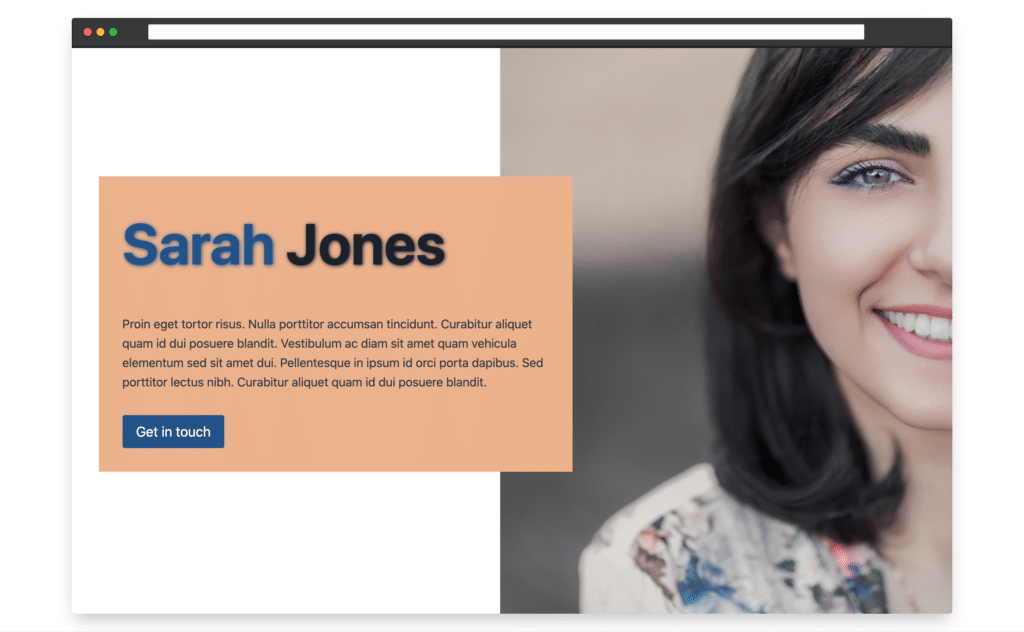
Here’s what we are going to build.
Video tutorial
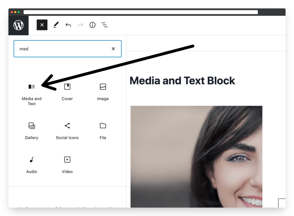
Step One: Add the Media and Text Block
First, add the Media and Text Block to your page.
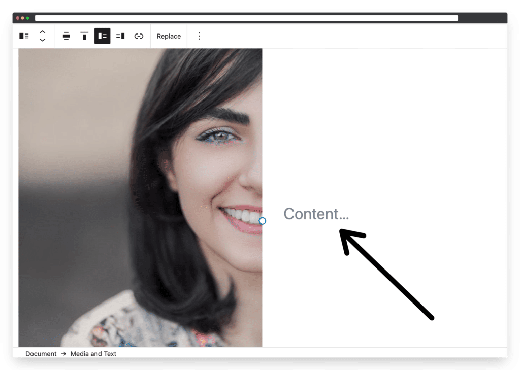
Step Two: Replace the Paragraph Block with the Columns Block (or transform the Paragraph Block into a Group Block)
First, we need to replace the Paragraph Block with a single column, Columns Block.
This is so we can add multiple Blocks within the Column, and set a background colour behind all the Blocks.
note: you could also achieve the same thing by transforming the Paragraph Block into a Group Block, as Group Blocks lets us put more than one Block into the same container, and set a background colour for that container.
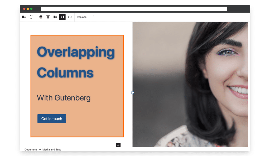
In the picture below you can see that I’ve added a Columns Block and then within that a Heading Block, a Paragraph Block, and a Buttons Blocks.
I’ve also added a background colour to the Column.
Step Three: Create the Column overlap
Now it’s time to create the column overlap effect.
There are two methods to create the column overlap, you can either add some code or use a plugin called Gutenberg Pro.
Method A: Using CSS Code
Just add the following CSS code to the WordPress customizer
*if you use the CSS code method then you won’t see changes in the Gutenberg Editor. You’ll see the overlap once you have published and viewed the page.
.wp-block-media-text.has-media-on-the-right .wp-block-media-text__content {
	margin-right: -150px;
}

.wp-block-media-text:not(.has-media-on-the-right) .wp-block-media-text__content {
	margin-left: -150px;
}
CSS code for stacking the media on mobile and tablet:
@media (max-width: 640px) {

    .wp-block-media-text:not(.has-media-on-the-right) .wp-block-media-text__content {
        margin-left: 0px !important;
    }

    .wp-block-media-text.has-media-on-the-right .wp-block-media-text__content {
        margin-right: 0px !important;
    }

}
Method Two: Use the Gutenberg Pro plugin
If you don’t feel happy with adding CSS code then another option is to use the Gutenberg Pro plugin.
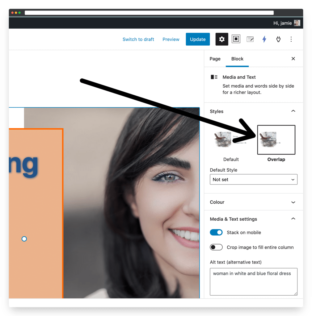
Gutenberg Pro adds an Overlap option in the Block settings panel, shown in the picture below.
Three additional customization options with the Media and Text Block
There are two extra options that you might want to use with the Media and Text Block.
Option 1: Change the size of the Text Box
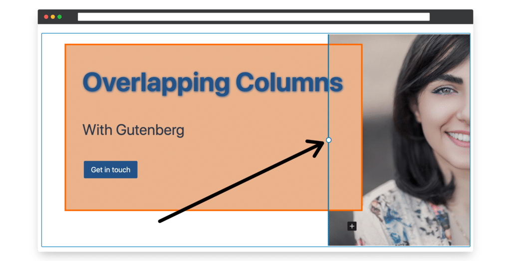
Simply drag the Blue Dot shown in the diagram below to change the size of the container box.
Option 2: Change the vertical position of the Text Box
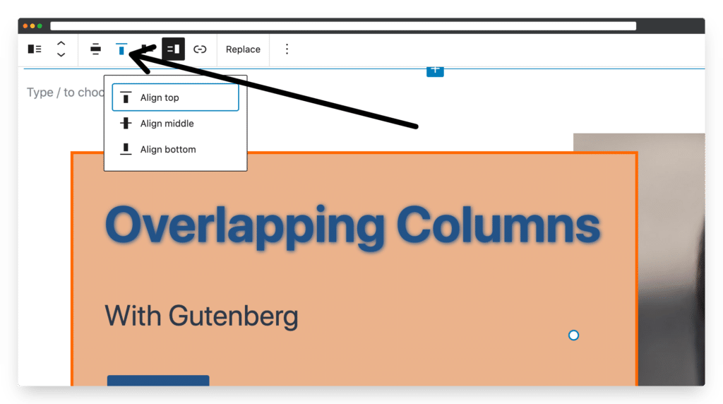
To change the vertical position of the Text Box click on the icon shown in the picture below.
Option 2: Swap the content and image position
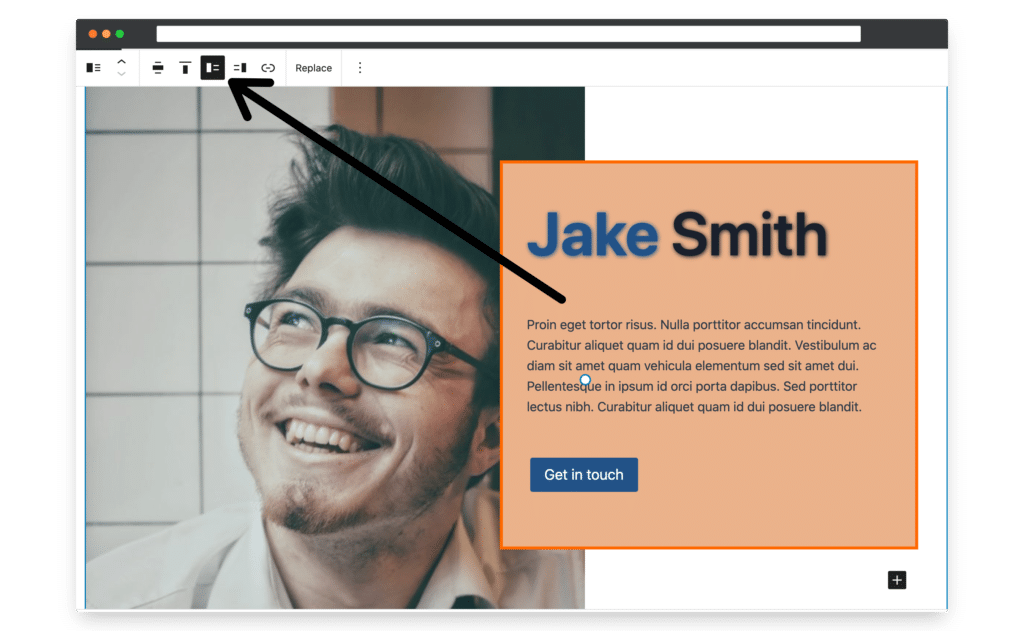
To swap the position of the image and text click on the icon shown in the picture below
Conclusion
The Media and Text Block is one of my favourite core Gutenberg Blocks. I hope you find this tutorial useful, and if you have any questions, please feel free to leave them in the comments below.
Leave a Reply