Most businesses don’t spend a lot of time thinking about how customers will come across their WooCommerce products when designing their WooCommerce site. By default, the WooCommerce shop page is laid out in a very bland way. Users can browse and select products from rows of products all laid out the same generic way.
While this might be fine for some, it’s certainly not the best option for all online stores.
Ideally, you want an attractive WooCommerce store with a well-crafted shop page. This can make your brand stand out from the competition, boost user engagement, increase conversions, and generate more revenue.
Adding a WooCommerce product grid is one of the most important design steps you can take to enhance your online store. It helps your store differ from other websites and stand out from the competition.
In addition to this, it impacts customer experience and affects brand perception for prospective customers. Visitors will be able to see lots of your products at a glance and add them to their shopping cart quickly. This not only shows off visually attractive products, but also encourages users to browse your WooCommerce store in a way similar to how they would browse a brick-and-mortar store.
In this article, we’ll take a look at how Pootlepress’ Storefront Blocks can help you customise your WooCommerce store by adding a product grid.
Storefront Blocks: an all-in-one solution for creating beautiful WooCommerce stores
Storefront Blocks is an all-in-one plugin that lets you create beautiful WooCommerce stores. You can use it to showcase products beautifully anywhere on your site using a range of new blocks within the Gutenberg editor. This means that you can display your WooCommerce products exactly according to your brand requirements, while also making them look aesthetically pleasing.
It also lets you use the robust blocks anywhere on the site where Gutenberg is enabled. You’re not just limited to displaying your products on your main store page, you can also include them in places such as your homepage, on your category pages, and even in your blog posts. This allows you to offer a unique shopping experience and sell all types of WooCommerce products on your online store.
In addition to being compatible with all WordPress themes, users can also build an entirely new store page using the blocks available with the Gutenberg editor. Storefront Blocks is great for creating stunning layouts for WooCommerce shop and category pages in just a few minutes. It can help you make more sales while also improving the SEO of your WooCommerce store.
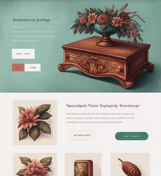
Storefront Blocks
Beautiful WooCommerce Blocks
How to create a product grid in WordPress with Storefront Blocks
Pootlepress’ Storefront Blocks offers a wide variety of different product grid layouts that look and function differently. This means that businesses can select and use the product grid that suits their requirements and needs the best.
There are three broad types of product grids that you can create:
- Product Blocks. WooCommerce Blocks to display your products in awesome layouts.
- Category Blocks. Display your WooCommerce product categories in visually appealing layouts.
- Tables And Lists. These can be used to display products vertically in lists and tables.
Visual Product grids
Visual Product grids are great for drawing attention to individual products on your WooCommerce store. You can use them on your WooCommerce homepage to showcase your featured products and on your WooCommerce product category pages to highlight the best selling products in that category.
Square Grid Product Block
The Square Grid Product Block lets you display featured products in a clean WooCommerce product grid with large images and product names.
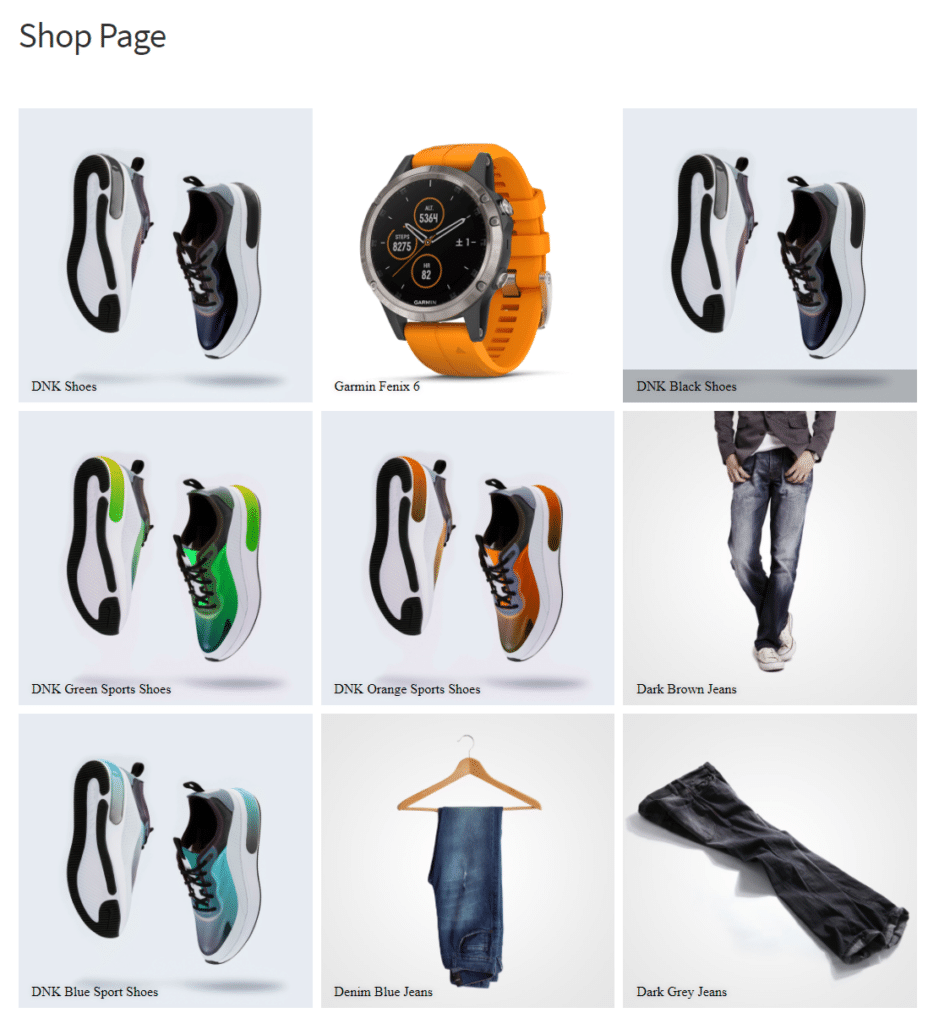
Customers can click through to access the product pages. This works great if you’re going for a minimalist, professional look for your featured products.
Product Card Block
The Product Card Block lets you display product images on large cards.
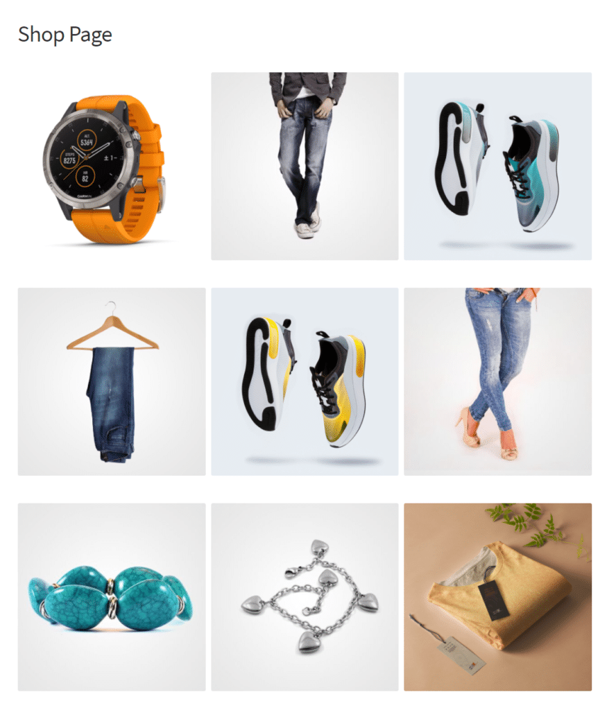
Once the user hovers over the card, it will flip over to reveal the product details. This is ideal for displaying eye-catching products with fine details on your WooCommerce store.
Masonry Product Block
The Mansory Product Block lets you showcase a number of products at once in an attractive masonry layout.
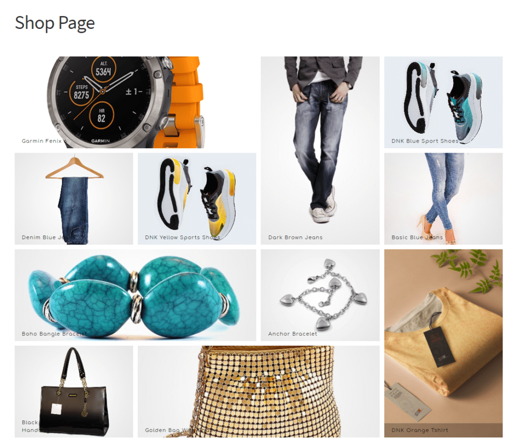
This is perfect for stores that have lots of beautiful products to showcase at once and it looks more dynamic than the default layout. It can help give your e-commerce store a more professional, unique brand look instead of the generic, bland default look.
Filter Block
The Filter Block is a WooCommerce product grid that lets you display products in an attractive visual layout, but with a series of filter buttons that allow customers to pick and choose which types of products they want to browse.
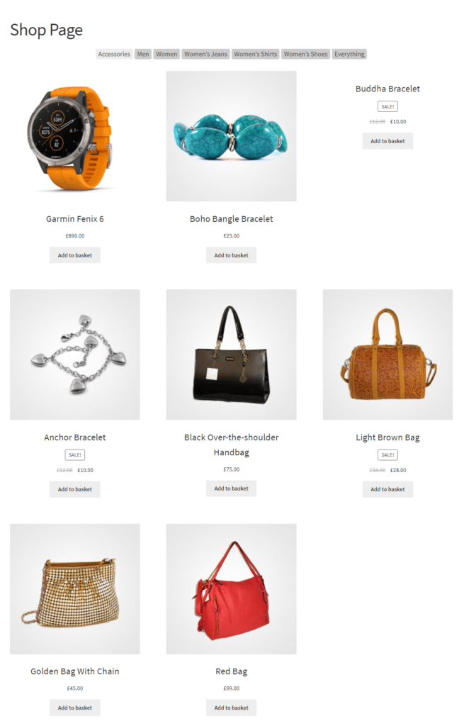
It lets users filter out products from your WooCommerce store in just a few clicks, and immediately select them with clear add to cart buttons. This is great if your store has products from a range of different categories and you want visitors to be able to browse through the ones they are interested in.
Visual Category grids
Visual Category Grids look similar to Product Grids but are actually a visual representation of your WooCommerce Category pages. This way, it makes it easier for visitors to get straight to the category they’re looking for on your WooCommerce store.
Category Masonry Block
The Category Masonry Block lets you display featured images for your WooCommerce store’s product category pages in a masonry layout.
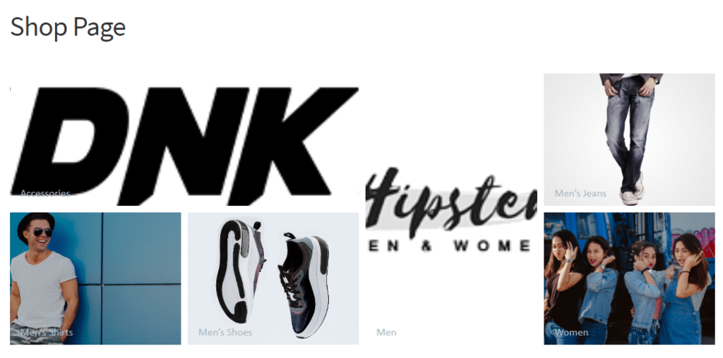
This is great for welcoming visitors to browse your store further.
Category Square Grid Block
The Category Square Grid Block looks identical to the Category Masonry Block but has a square grid view instead of the masonry layout.
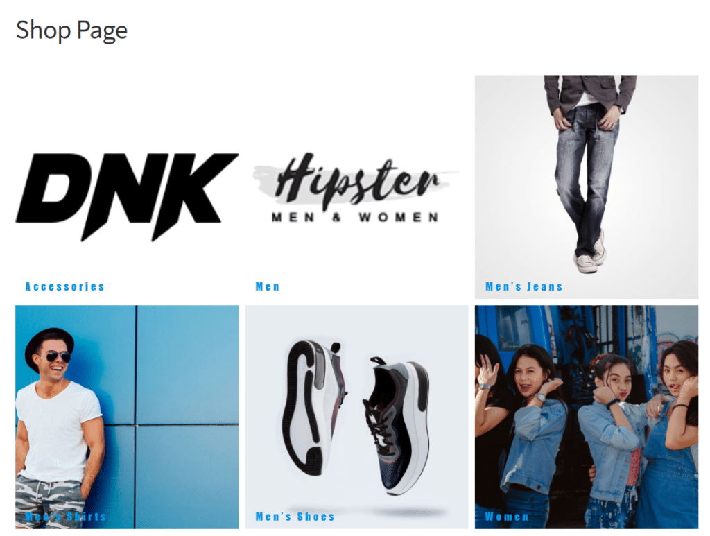
It is great for letting shoppers on your WooCommerce store browse through your product offerings quickly. This way customers can find the product they’re looking for easily and add it to their shopping cart.
Product Table and Lists
Product Table and List Blocks are more suited towards stores that need to display technical information for products so customers can make an informed purchase decision. This means that it’s important for visitors to be able to read product descriptions or technical specifications before clicking on the product to learn more about it.
For instance, book stores can provide additional information about their book so customers don’t judge the book by its cover. This might include the book’s genre, year published, and author name. Similarly, hardware stores can provide technical information about products such as nuts and bolts. Since there are a lot of products that look the same from the photo but are actually in different dimensions from each other, the list layout helps customers use the technical information to add the correct products to their shopping carts.
In addition to this, both product grids include easy “add to basket” buttons to speed up the purchasing process. This way, customers can select multiple products or product variations from the product grid and add all of them at once to their shopping cart. This not only helps customers make informed purchases but also boosts sales and revenue for your business.
Product Table Block
The Product Table Block lets you display WooCommerce products in a sortable table with lots of space for descriptions. You can also add a “quantity” field that customers can set to quickly add many units of the product to their cart at once.
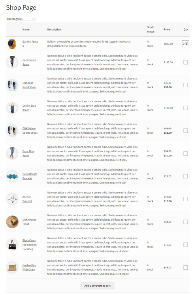
This is perfect for products that customers buy regularly such as grocery items. You can make it easier for them to buy those products quickly by using the Product Table Block. It also adds pagination links below the table to improve the shopping experience.
Product List Block
The Product List Block displays a list of products with small thumbnails and plenty of room for descriptions, price, and add-to-basket buttons.
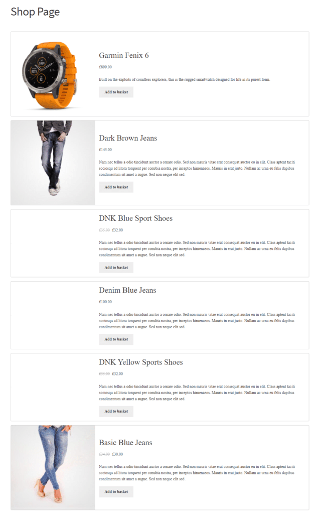
This is similar to the Product Table Block but displays products in a list-style format with lots of
room for detailed descriptions. This list view is great for showcasing featured products and sharing stories about them in the descriptions tab.
Customising your WooCommerce Product grids
Pootlepress’ Storefront Blocks provide a lot of customisation options for WooCommerce product grids. Every single Storefront Block comes with a huge amount of customisation potential. Users can customise WooCommerce product grids in multiple ways including by customising the numbers of rows and columns in a grid, changing the gaps, setting the margins, adjusting shadows, and selecting different background colours and fonts. Additionally, you can also view different displays on mobile and desktop so that the design works for all customers regardless of which device they’re using to browse your online store.
Whatever you’re selling and whatever your store’s aesthetic is, Pootlepress’ Storefront Blocks has you covered. It’s built with extensive customisation features so that you can make your WooCommerce store look and feel professional and unique.
Additional features
Storefront Blocks let you do so much more than just add product grids to your WooCommerce store.
This plugin comes with a wide variety of powerful blocks that let you change your store’s design and styling. Storefront Blocks contains some robust functionality that include:
Flip Book Block
Using the Flip Book Block, you can showcase individual products one at a time with a large image, description, and price.
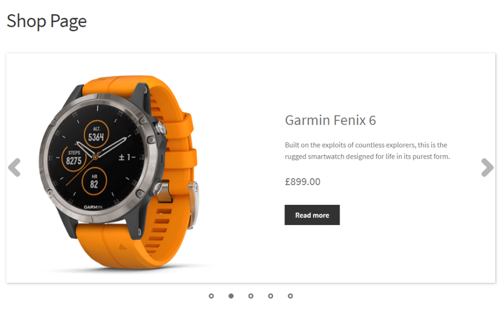
This is perfect for displaying eye-catching products on your WooCommerce store. It can also help your customers make purchase decisions quickly.
Product Carousel Block
The Product Carousel Block lets users display a carousel of several WooCommerce products at once on a single row that auto-plays through or lets users scroll through it manually.
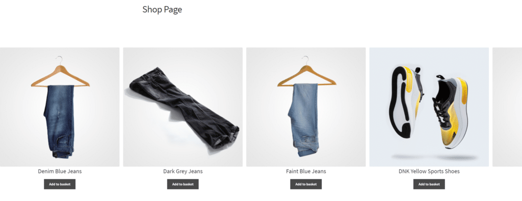
It’s ideal for drawing attention to a few key visual products at a time on your WooCommerce store. You can grab your customer’s attention quickly which, in turn, helps them move through the sales funnel quickly.
Single Product Block
The Single Product Block is great for displaying a single product on an eye-catching background.
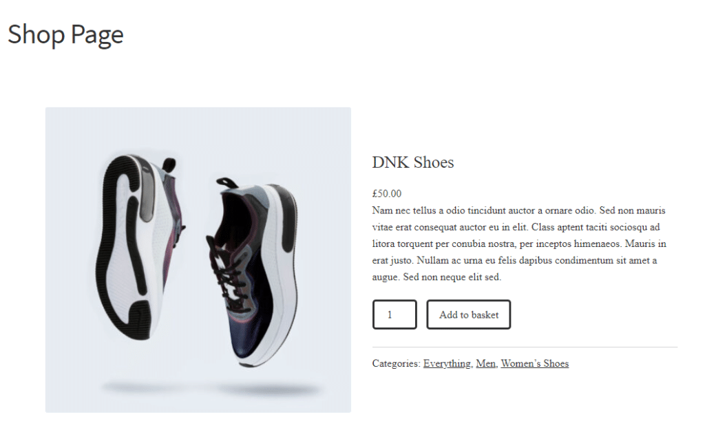
In addition to this, it also has plenty of space for the price and an “add to cart” button. This works the best for creating calls to action on your category pages or blogs about specific products.
You can also use the Single Product Block as a way to draw attention to featured products on your WooCommerce shop page.
Sales Countdown Block
The Sales Countdown Block allows you to add a sales countdown anywhere on your WooCommerce store.
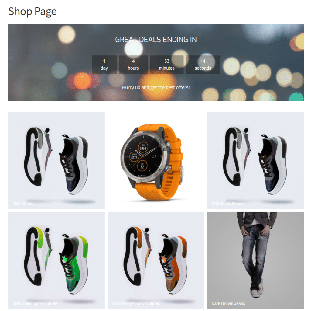
A sales countdown can help highlight deals and increase the urgency for customers to buy quickly from you before the deal ends.
Conclusion
The design of your WooCommerce store is crucial in making your store stand out. It helps your brand be more memorable and makes the customer’s shopping experience more enjoyable.
Storefront Blocks is the perfect solution for anyone looking to customise their WooCommerce store. Without any prior coding experience, users can create attractive WooCommerce shop pages, WooCommerce category pages, and WooCommerce single product pages quickly and easily. In addition to this, Pootlepress’ Storefront Blocks lets you set up a distraction-free checkout for your WooCommerce store. This not only boosts sales but also helps increase the average order value on your online store.
Ready to give your eCommerce store a makeover with a WooCommerce product grid? Get Storefront Blocks today!
Leave a Reply