We’ve had a few questions lately on why backgrounds images are cropped when viewed on a mobile phone. So here’s an article that tries to explain what’s happening here.
Note – We use background images and text in our Storefront Pro, 18Tags Pro and Pagebuilder Pro plugins.
Background images are in-fact mobile friendly , but maybe not in the way that you may expect.
If gets a little complex to explain why background images don’t scale to show the entire image, but let me have a go. The reason primarily is because we are using backgrounds images with a combination of text.
Now this is simple when viewing a website on a computer, because we can typically show the whole of the image.
Exhibit 1 – Background image + text when viewed on a laptop

So that’s nice and simple,
The difficulty comes when we want to view the same combination i.e background image + text on a mobile phone.
We could scale the background photo so that we show the entire width of the photo. However there is a big problem with this approach. If we scale the width, to show the entire width of the photo , then we also need to proportionally scale the height.
And this is what happens.
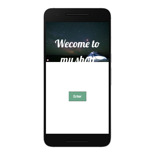
Option 1 – Show the whole width of the image on a phone
See the problem?
If we set the image to ‘fit by width’ so that we show the entire width then we also need to scale the height to the same proportion. So now we see the whole of the image, however the height has reduced so much that the image only covers about one third of the screen.
We could use this , however our text is now dropping below the image. We could reduce the size of the text, but it would be so small that it would be almost impossible to read. So this isn’t a good solution.

Option 2 – Background image set to ‘cover’ so that any text always fits
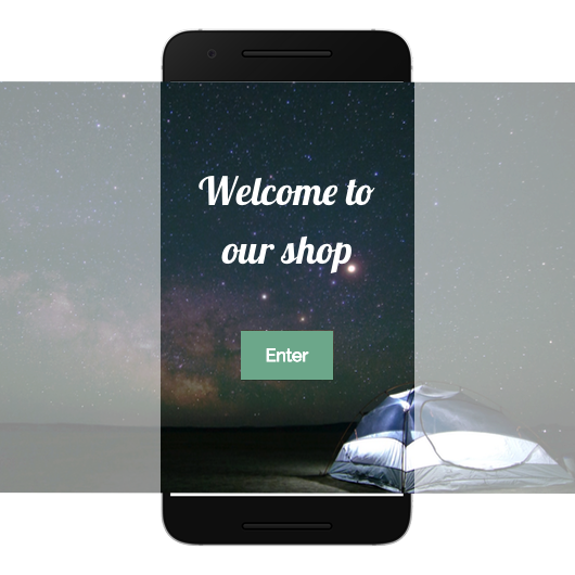
So instead of scaling the image so that it fits by width, we use a neat trick whereby we set the background image to always ‘cover’ any text contained within it . This has the result that the background image appears cropped, but has the major benefit that text will always appear over the background image.
The background image size also flexes depending on the device it’s being viewed on. So text will fit regardless of the size of the screen.
In this solution we are scaling by height so that the text will always overlay the image. The result is that the left and right edges of the photo appear cropped, but we have maintained the proportions of the photo and the text and call to action button work nicely.
Here’s a picture that illustrates what’s actually happening

I hope that helps explain how background images work when combined with text, if you have any questions please post them as a comment below.
Leave a Reply