Creating a compelling homepage is important and fun – so here are 10 layout possibilities. We used our free 18 tags theme when building these, but hopefully, they will give you inspiration, whatever theme you are using (Canvas and Storefront users note that most of these layouts are possible with our extensions) . I’ve also provided a short explanation under each image on how each page was built. If you have any questions, please feel free to leave them in the comments area below.
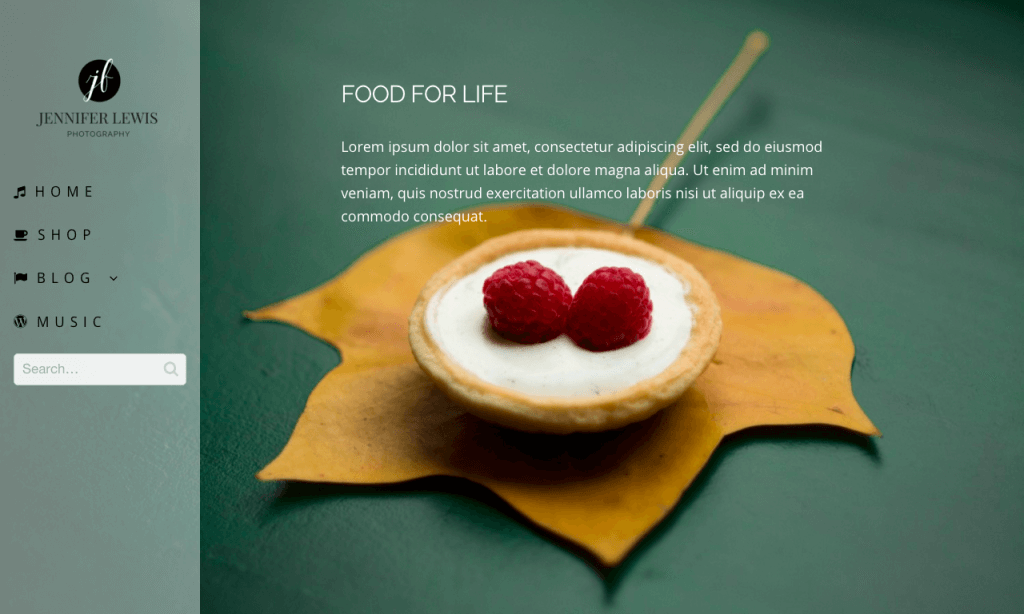
How the Left hand vertical navigation home page was put together
- First I selected the left hand vertical navigation for the primary menu
- Using the in built page customizer that comes with 18 tags, I uploaded the background image
- I then made the header (now on the left) 80% transparent
- I then add font awesome icons to the menu items
- I uploaded my logo in header setttings
- Finally I made the primary navigation menu items upper case and changed the color in primary menu settings
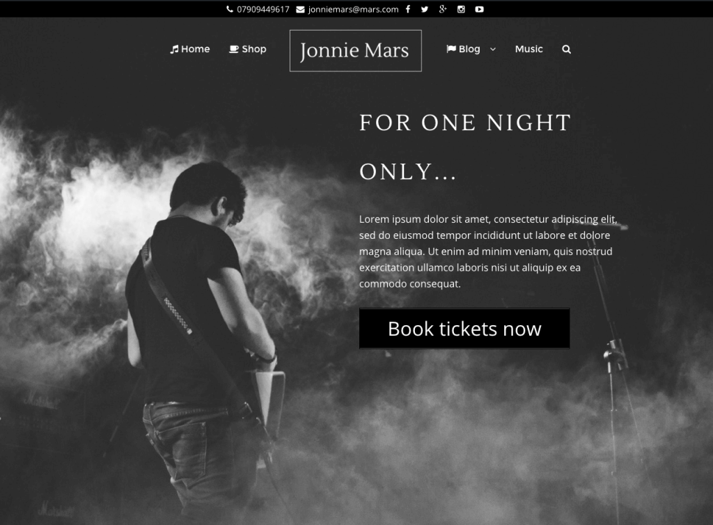
How the Rockband home page was put together
- First I selected the inline logo option in primary menu
- Then I changed the background color of the header and made it slightly transparent
- Then I added contact information and social icons in header options
- Then I added the text and aligned it using our free Pootle pagebuilder plugin
- Then I added the big call to action button using the free shortcodes ultimate plugin
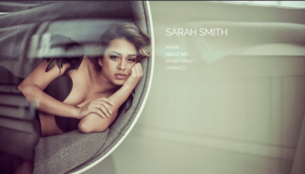
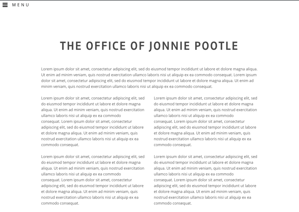
How The Story home page was put together
- First I hid the header using the in built page customizer
- Then I uploaded a background image
- Then I styled the footer widgets
- Then I aligned the text using our free Pootle pagebuilder plugin
- Then I finished things off by choosing the footer and body text fonts and colors
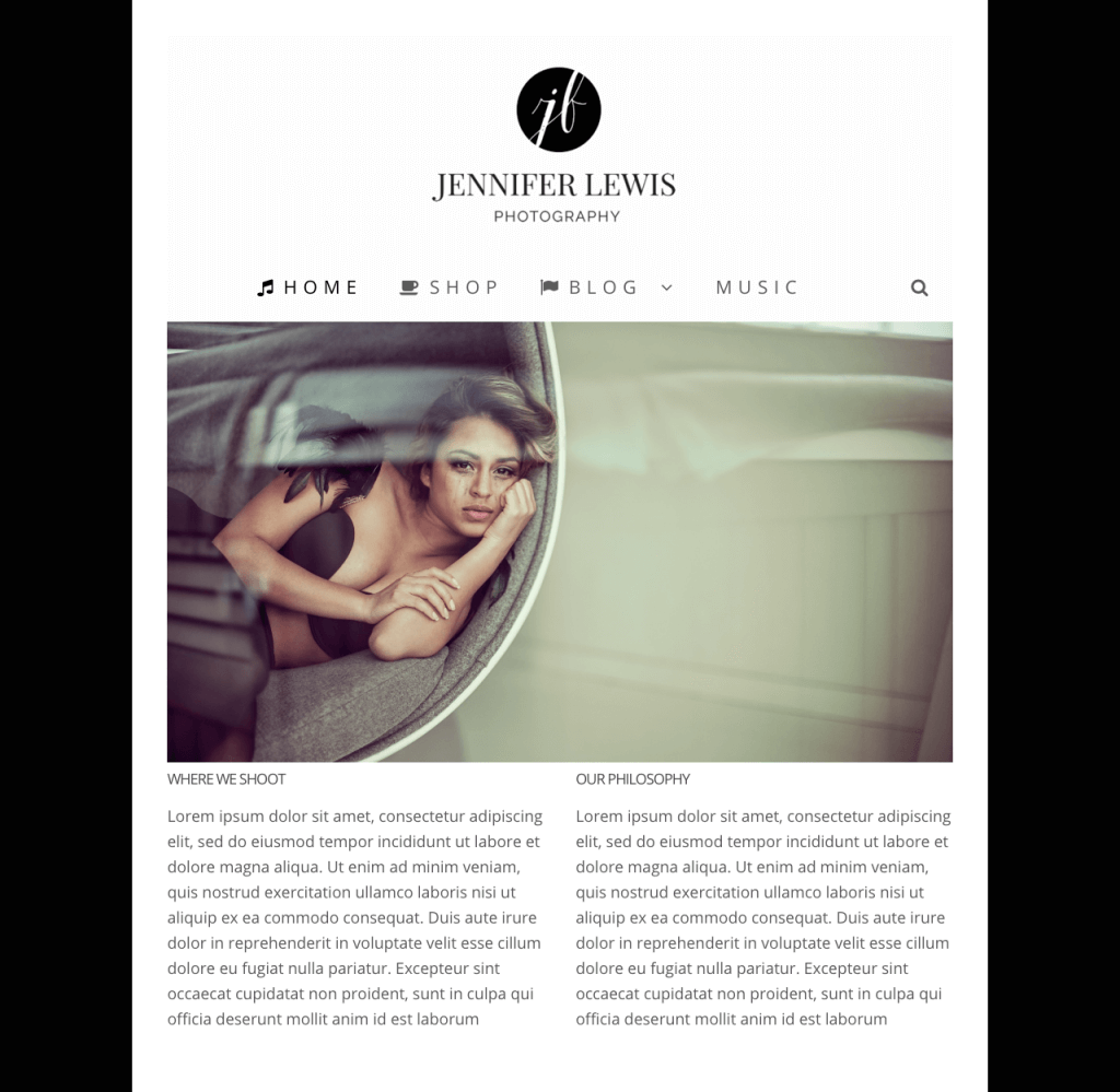
How the The Boxed layout home page was put together
- First I selected the boxed layout option in layout and chose the box background color
- Then I set the background color of the website to black
- Then I chose the centered logo option setting in primary navigation
- Then I added a slider using our Photography extension for Pootle pagebuilder
- Then I added a row with two columns using the Pootle page builder
- Then I added font awesome icons to the menu
- Then I styled the menu, increased the letter spacing and font size
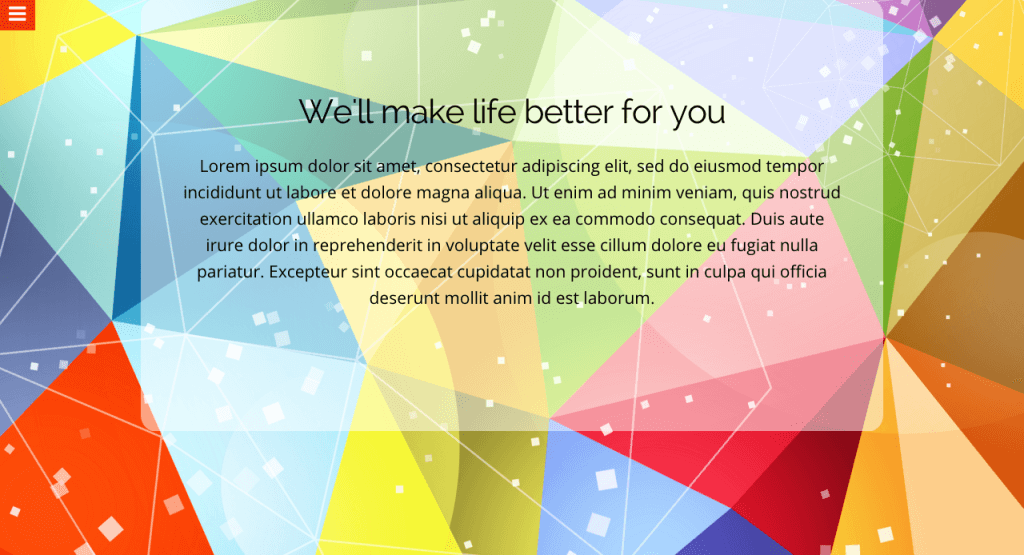
How the Low Poly Hamburger was put together
- First I selected the hamburger menu option in primary menu
- Then I uploaded a background image for the page, using the in built page customizer
- Then I added some text using our free Pootle pagebuilder plugin
- Then I added a transparent overlay to the content area to make the text more punchy
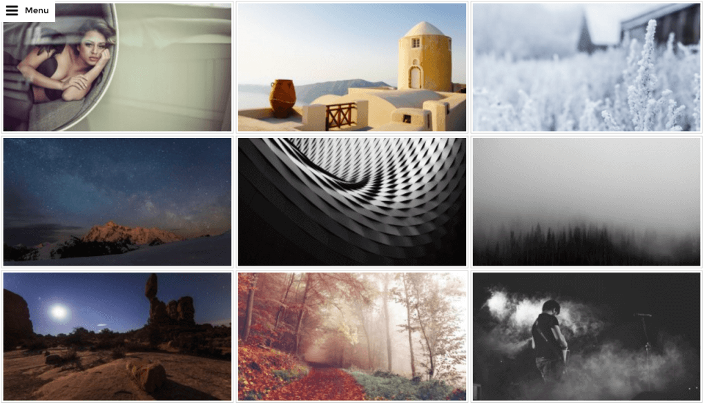
How The Grid was put together
- First I selected the hamburger menu option in primary menu
- Then I uploaded a gallery using the Photography extension to Pootle pagebuilder
- Then I added some text using the Pootle pagebuilder plugin
- Finally I changed the color of the hamburger menu to match the colors of the background image
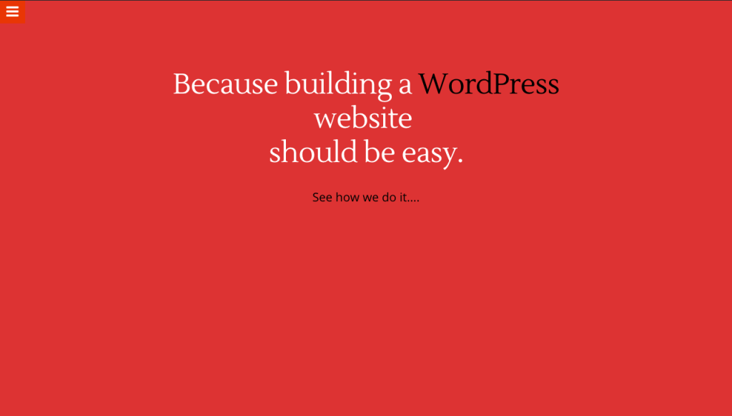
How the ‘It has to be Red’ home page was put together
- First I selected the hamburger menu in primary menu options
- Then I changed the background color of the home page to be red – using the in built page customizer
- First I hid the header using the in built page customizer
- Then I hid the footer
- Then I added the text using our Pootle pagebuilder plugin
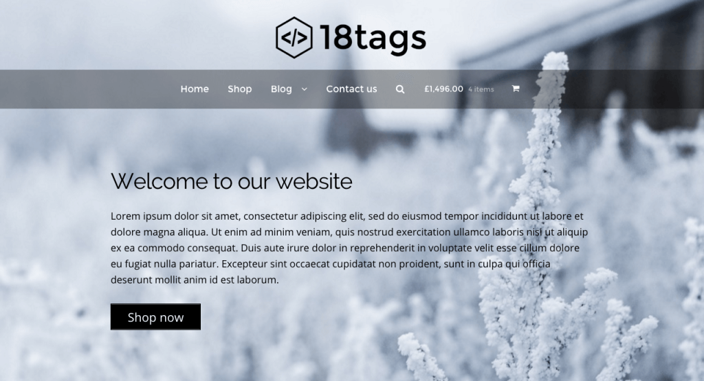
How the Transparent menu home page was put together
- First I selected the selected the centered logo option in primary menu settings
- Then I changed the background color of the menu and made it slightly transparent
- Then I uploaded a background image for the home page using the in built page customizer option
- Then I styled the menu items in primary menu options
- Then I added the text using our free Pootle page builder plugin
Customer name: Greg Collett
From: Canada
About Greg: Greg’s heart is on the open road, with his bike, touring North America. Every now and then he takes a pit stop to design and build websites for nice clients.
Greg and Pootlepress: Greg has been using Pootlepress plugins exclusively for the last couple of years. He’s able to build and deliver clean and cool websites with minimal hassle, keeping his clients happy, which means Greg can get back to the open road – keeping Greg happy 🙂
Greg says: ‘Do epic s***‘
Uses: Storefront Pro and Pootle Pagebuilder.

Leave a Reply