It’s no secret that Canvas Page Builder is our most popular Canvas Extension. We have been working on a few enhancements based on our continued use of it for customers of our WordPress Xpress days and, more importantly, your feedback.
We’re hoping to launch it next week and so here are a few ‘sneaky peek’ screen grabs of some of the new features. Let us know what you think in the comments (we know you will!)
1. User Interface improvements
The first thing to mention (or it will confuse you) is that we have made some simple, but effective user interface face improvements.
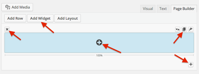
- Firstly, we have changed the add row, widget and layout icons to words, so it is easier to understand.
- Secondly, we have changed the icons to official WordPress icons to better blend into the WordPress environment and better describe what each option does (for example we have changed the delete row option from a ‘-‘ icon to a ‘x’ icon and moved it over the left, out of the way). Credit goes to Rob Elings (robelings.com) for this one! Thanks Rob!
- Finally, we have also added an add widget icon (the round circle in the middle of each row) so that widgets can be added directly from a row. This saves going right to the top a long page to add a widget.
- We have also added an add row icon at the very bottom right of the interface so that you don’t have to go all the way back to the top on long pages to add a row.
Although these improvements will take a little time to get used to, we hope they will save you time!
2. Clearer widget naming
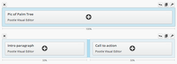
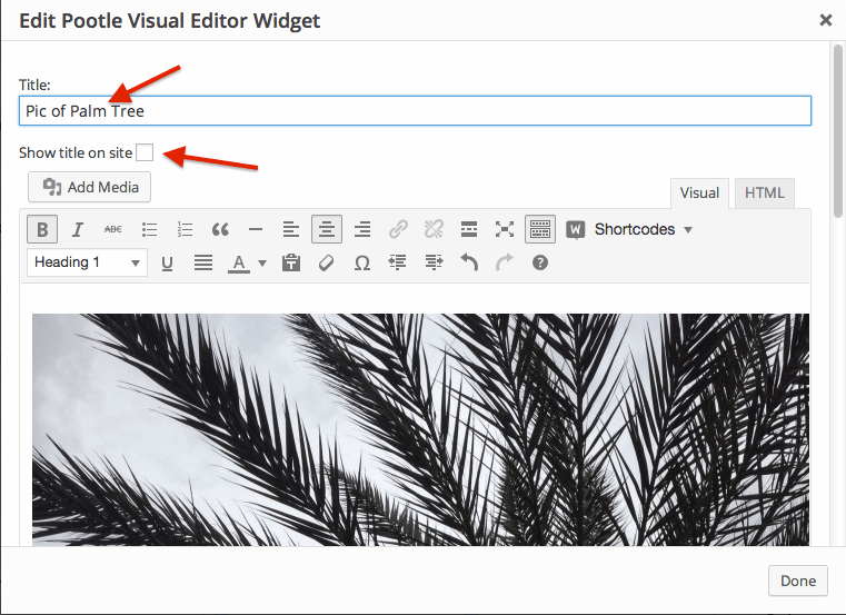
We have made the naming of each widget a lot clearer so that you can easily see what is inside each widget. The Pootle Visual Editor widget now has a title that displays as the main widget title, with the name of the widget below it in smaller type. So you can set a title for each widget making it easier to edit each widget if you have a large page.
By default this title does not appear on the site, by you have an option to show it. See below:
3. Widget level styling and customization
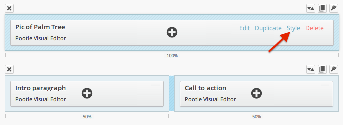
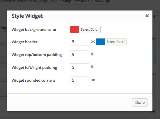
There is now a new option for styling on a widget by widget basis. You can style background color, widget border, widget padding and rounded corners without custom CSS! We have kept the padding as % because this will make your widgets work much better responsively (e.g. on smart-phones)
4. Duplicate rows with 1 click
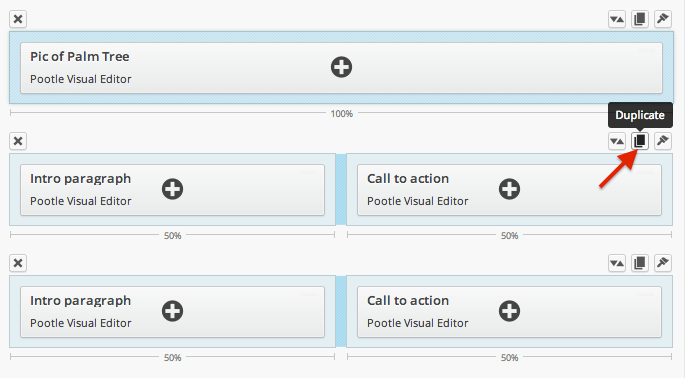
We have introduced a duplicate rows button that allows you to duplicate a row with 1 click. This one is a real time saver!
5. Keep content at site width for full width rows
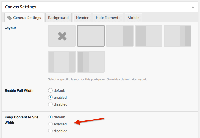
This is actually an update in the next version of Page Customizer, but it is meant to work great with Canvas Page Builder. It is something a lot of you have been asking for.
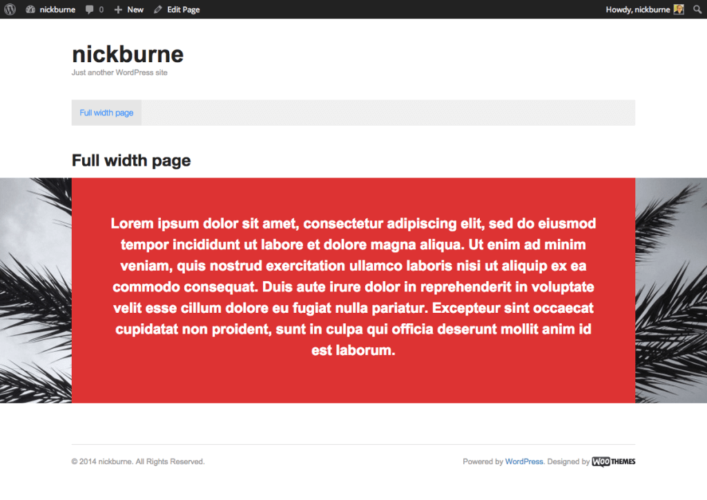
This feature works for full width pages and rows and sets the content inside those rows to the same width as the site. See the screen grab below for a very simple representation. Here the row background image (or it could be color) remains full width. The background red color you are seeing here is the widget background…
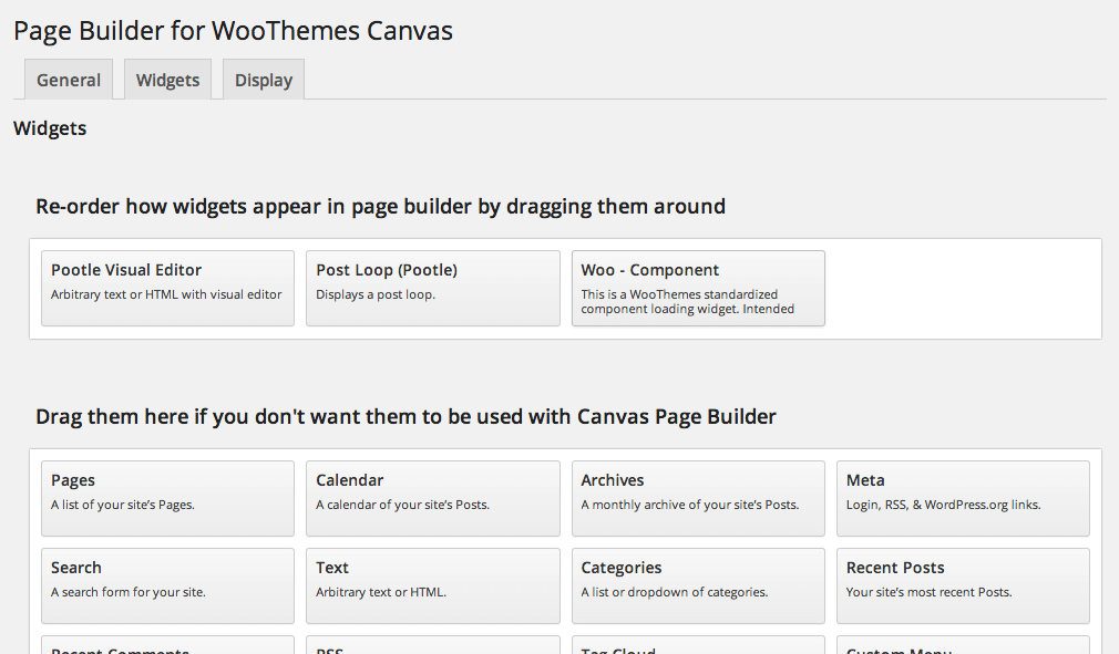
6. Drag and drop widgets to use with Canvas Page Builder
There is a new tab in Settings > Page Builder called ‘Widgets’. It allows you to choose which widgets you use with Canvas Page Builder so that it’s much easier to select the right widgets. It works by dragging and dropping widgets around. If you work with clients then this is a great feature as it allows you to simply the widgets they have to choose from to stop them using widgets that can cause issues.
7. Reduce time costly mistakes with deletion safety
We have moved the delete row icon to the left hand side of the row so it is away from the other option and changed it from a ‘-‘ icon to a ‘x’ icon.
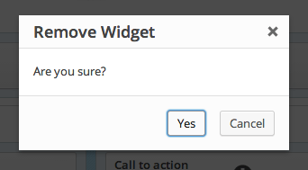
We have also added a confirmation box on both row delete and widget delete options. This, plus keeping original undo message at the top of the screen, means it is harder than ever to make a costly mistake.
So there you go. Some of the cool things in Canvas Page Builder 2. We’re hoping to launch it next week! Comments and thoughts below…

Leave a Reply