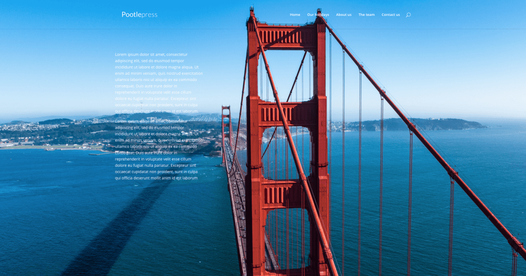
Here’s a simple tutorial on how to create a beautiful fullscreen website with the Divi Theme from Elegant Themes. This tutorial uses the free css plugin from Site Origin that can be downloaded here . I’ve also included all the CSS that you will need to reproduce this on your own websites. The CSS can be found below the video. If you would like to see a real life example of this effect in action, check out this Divi theme fullscreen example website. If you have any questions, please leave them in the comments below.
How to create a beautiful fullscreen Divi website with 5 simple tweaks
Comments
26 responses to “How to create a beautiful fullscreen Divi website with 5 simple tweaks”
-
Hi Jamie, thanks für this tutorial.
In the demo page there is a secondary menu in the top left in the header. How is that done with divi?
-
Hi Michael, I see your question is from July, so not sure if you ever got your answer? Anyway it’s done using the header elements when customizing your theme (Appearance > Customize > Header & Navigation > Header Elements). For it to appear there though, you need to also set a secondary menu.
-
-
Excellent. Thanks very much! I really needed this.
Question: Is it possible to have more than one button on the page? (talking about the ‘click’ here button. I am looking at this page:
http://www.domainpropertygroup.com.au/
and wondering how they made the contact, buy, rent, sold links below the logo. -
Thank you! very clear and helpful
-
Jamie,
Thanks so much for this tutorial. My background image seems to duplicate?
http://new.tesoromusic.org/marching-band/Mark
-
-
Hello,
I’m tested and it’s working realy nice.
But in case if I define in Divi/General settings/Background/ Background image
the css page-id-xxx not show separate background image. On all pages is background image defined in General settings.
How can awoid this situation. I would like to define one general background but oa some pages I nead diferent one. -
Thank you for supplying such great information, very helpful in making a beautiful website. I got this to work for my home page, but I cannot get it to show on any of my other pages.
Also, is there a way to make the background responsive for mobile?
-
I had this same issue when I was inputting the page names as I created them (about-us, contact-us for example). Then I inspected the pages with Chrome, and saw that the pages have ids (my about-us page was .page-id-144. I used that page id numbers and all worked fine.
-
-
Perfect! Some of my descriptions are longer than others, and since I want my description box anchored to the bottom of the slider, how can I edit the css so the text doesn’t get cut off at the bottom?
thanks! -
Hi, did you notice the line under the Primary menu that is now transparent?
I can’t find where to remove it!
And it bugs me to have this line now that I have a nice fullscreen page without distractions!
Thanks for help, I’ll continue to search on my side but help will be appreciated 🙂-
Hi again!
For information, I just found there was a sneaky box-shadow une this menu…
A simple box-shadow: none did the trick.#main-header {
background-color: transparent;
box-shadow: none;
}You should consider add it to your tuto and your css exemple!
-
Thanks jonas 🙂
-
-
-
Hi,
I’m having trouble getting my content to have transparent backgrounds. I followed your tutorial, but the code:
.et_pb_section {
background-color: transparent;
}isn’t making the sections transparent. Any ideas?
Thanks!
-
Is there any way to have the background images cycle on a specific page after say 3 seconds?
-
Any ideas? Tried a lot of different things without much success.
-
-
Is there a way to make the image stay and adjust itself when being used on a tablet, or smartphone. The computer does great, but the other two turns the background white.
-
Hi Tony, did you manage to solve the problem about the white menu on mobile phones? Thanks. John
-
-
Very nice tutorial with excellent results. Thank you very much.
-
How would I make the image scalable so it looks as good on mobile as it does on a desktop?
Thank you!
-
How might I put a darker overlay over the entire background after doing this?
-
Hi Jamie, thanks for all this info. One small problem: is there a limit to the transparent pages with full cover? Because it works on three of my pages but stops working on the 4th. Any idea what is happening?
-
sorry. managed to solve the problem. thanks again.
-
Hey. Can I do this with a video instead of an image?
-
Thank you very much! Exactly what I was looking for!
-
Thanks for this indepth tutorial. We are currently trying to implement this design in our website. But when we are using this codes, some of the portions on both side of the images gets cut. Do you have any other tutorial that you can refer me to that helps me to make the images responsive on mobile and tab please? Would really appreciate your help as we are in the middle of the development process.
Thanks. Waiting for your response -
Hi! Thanks so much for the tutorial, works perfectly on desktop but on an Android the background image doesn’t cover the whole background. Do you know what can I do to make it work on Android too? Thanks so much, I would really appreciate it.

Leave a Reply